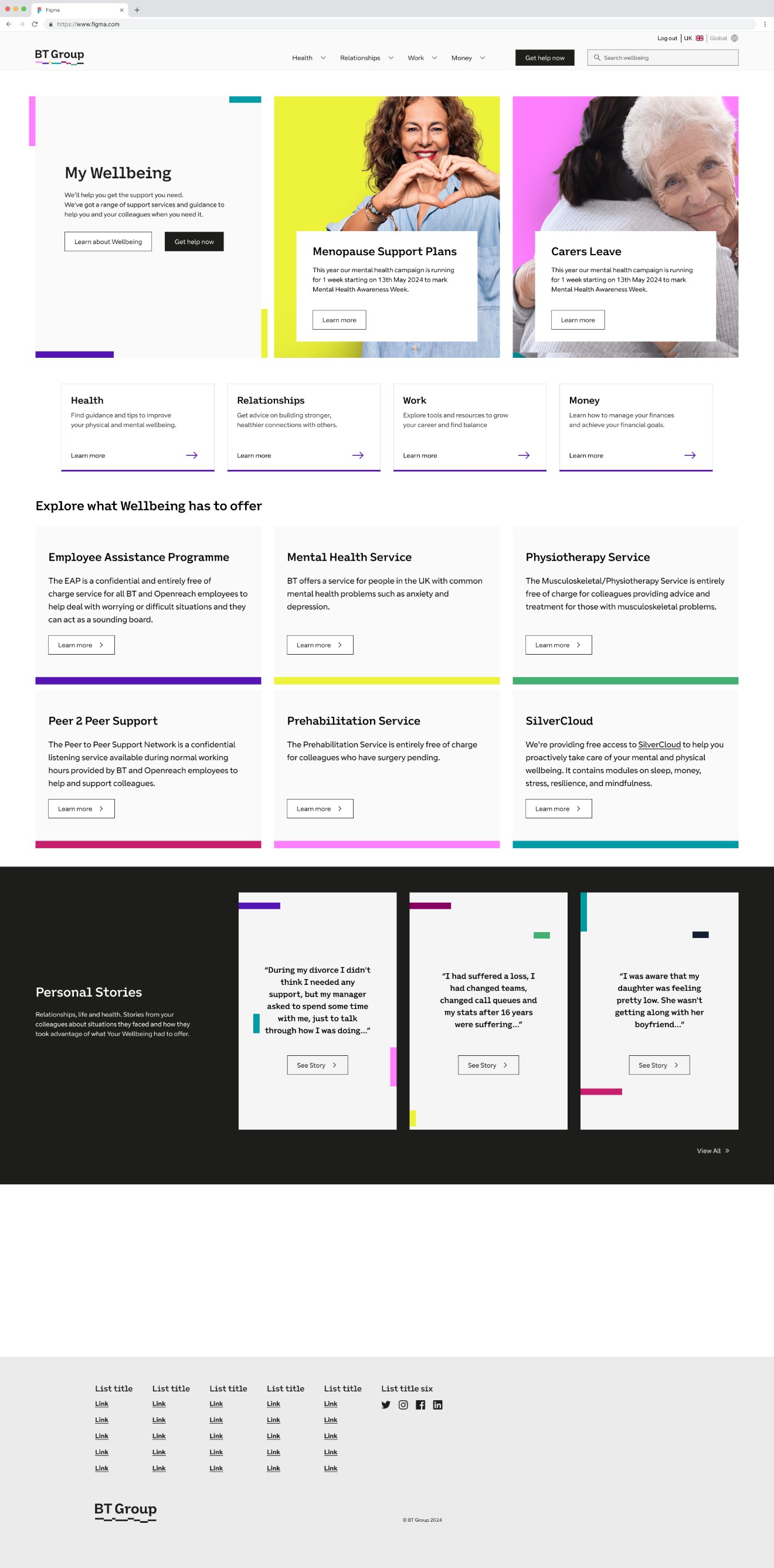
My Volunteering
Bringing a fragmented volunteering service into a single platform.
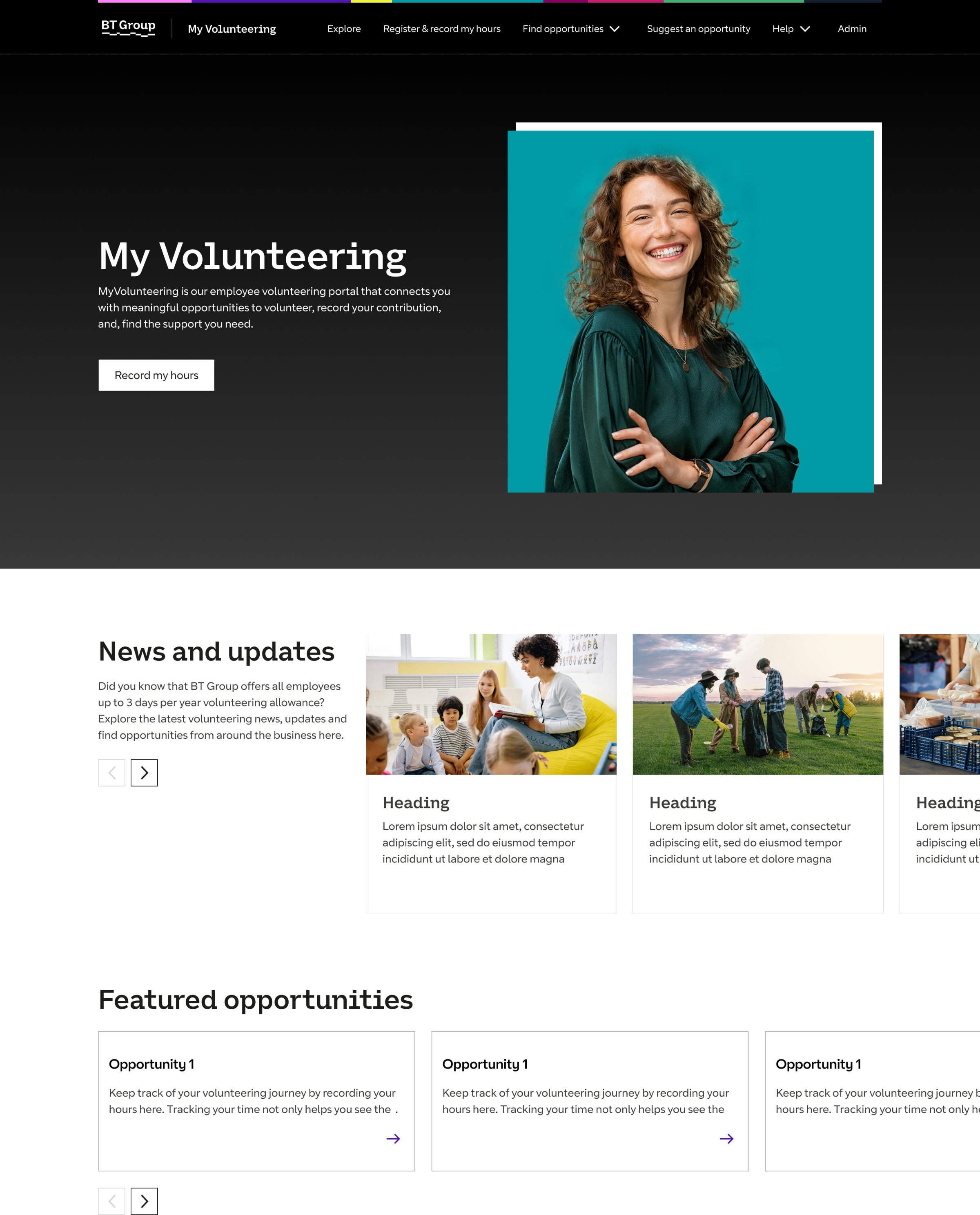
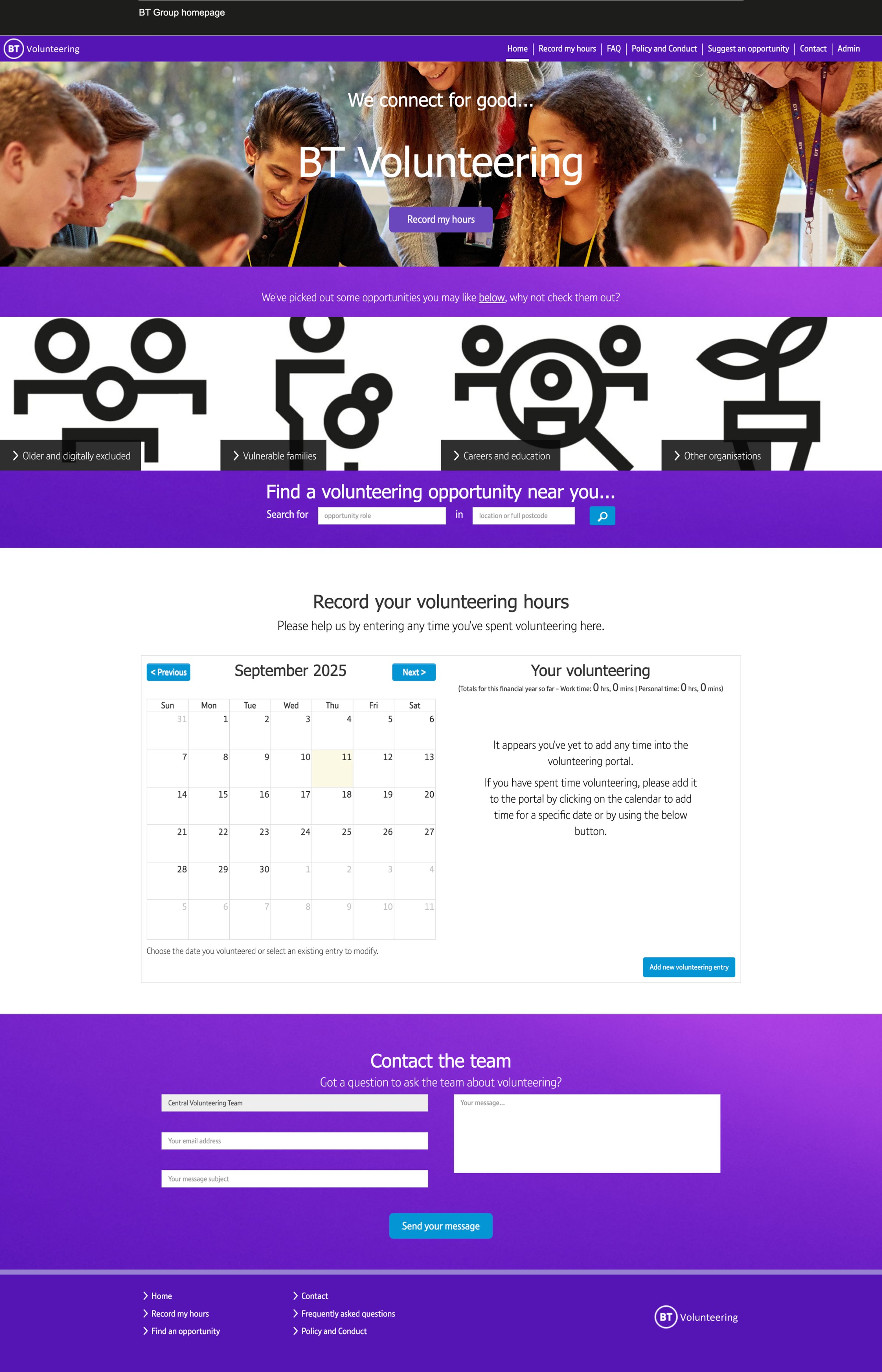
BT gives every employee three days of paid volunteering leave a year, but the service around it was scattered across systems, and only around half of the volunteering that happened was ever recorded. As the sole product designer, I reframed what began as a systems-integration brief into a platform strategy: one destination for discovering, applying for and recording volunteering.
Half the volunteering was invisible
Only around half of employees' volunteering activity was being recorded, leaving BT unable to report reliably on a benefit it actively promotes. The initial brief framed this as a data problem: integrate MyHR with the volunteering portal and the records would follow.
The journey told a different story. Information lived across a legacy portal and SharePoint, opportunities were promoted through different channels, and application processes varied from one opportunity to the next. The real challenge was a navigable service, from discovery through to recording, not just better data capture.
The reporting issue wasn’t a broken screen, it was a disconnected service
The assumption was that recording was too cumbersome. In reality, it happens after the volunteering is done, and its value accrues to the business, not the individual. It gets forgotten, not avoided.
Each hand-off between SharePoint, the portal and email was a drop-out point. No single screen was broken; the journey between them was.
A single destination that surfaces approved leave and prompts recording at the right moment removes the reliance on users remembering, the shift from integration exercise to platform strategy.
Reframing a reporting problem into a service opportunity
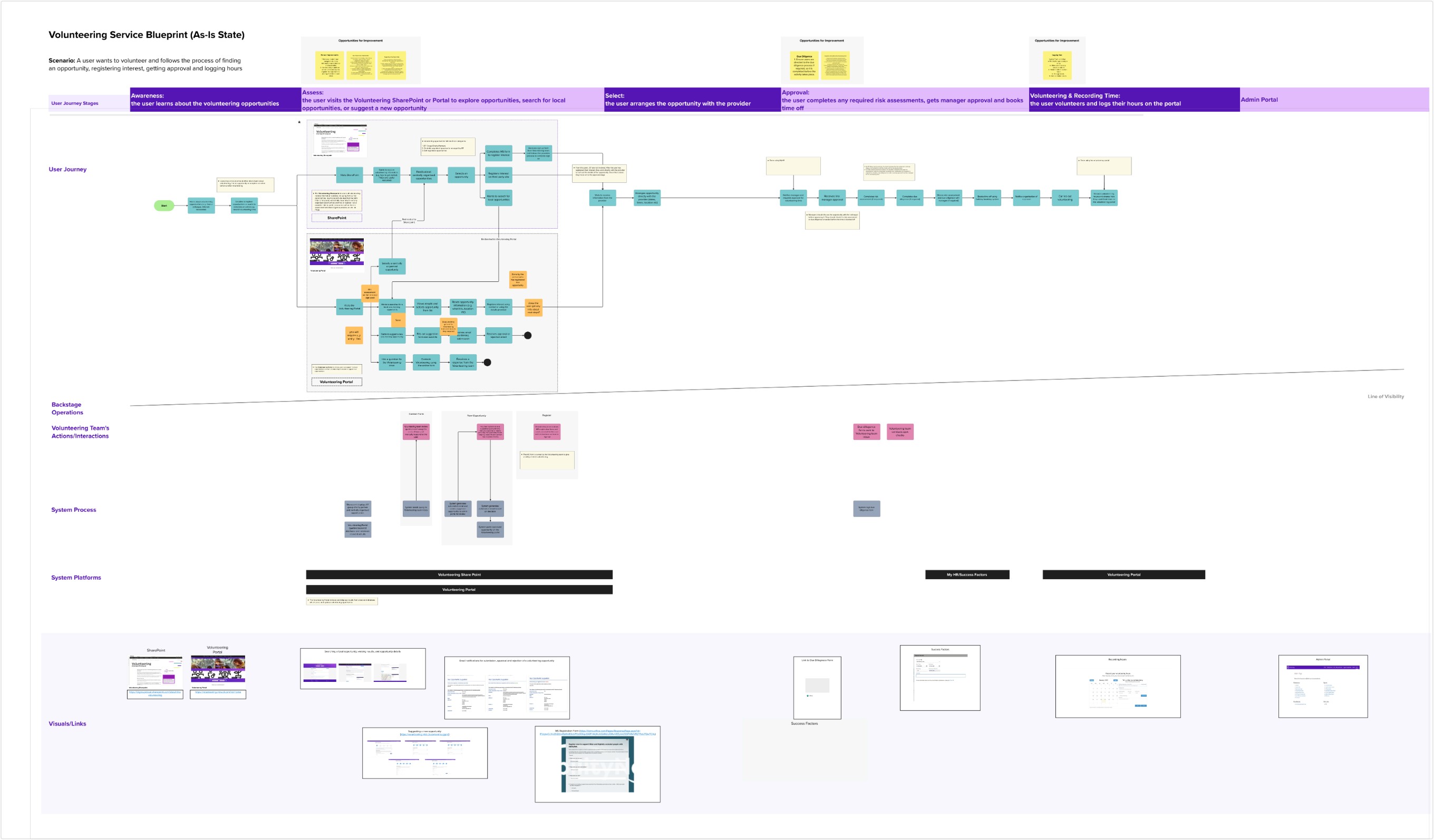
I challenged the narrow MyHR-integration scope with evidence: a service blueprint of the as-is journey, marking every drop-out point from awareness through to recording. It showed the fragmentation plainly, and made the case for consolidating information, discovery, applications and recording into one platform.
The volunteering team aligned quickly, because the platform served their participation goal too. Crucially, the reframe kept a clear MVP, a bigger vision didn't mean a bigger first release.
Designing a platform, not a collection of pages
The architecture was structured around system dependencies rather than page templates. A homepage and Explore area consolidated the content scattered across SharePoint and the legacy portal, backed by a unified opportunity database, BT-promoted and local opportunities searchable together, with shared categorisation, filtering and reporting.
Because charities apply in different ways, the platform supports multiple application methods, email, MS Forms, third-party sites, so the service could scale without forcing every provider through one funnel.
Reducing reliance on user memory
Working with solution architects and HR, I integrated approved volunteering-leave data into the platform itself. Approved leave is surfaced automatically as an unrecorded entry, and contextual email reminders cover the cases where MyHR constraints applied.
Instead of expecting users to remember to report, the system proactively supports completion, designed around real behaviour rather than ideal behaviour.
Better data, a fraction of the effort
in monthly reporting effort for the volunteering team, down from around half a day.
Rogue and erroneous recurring entries largely eliminated, restoring confidence in the numbers.
Recorded volunteering entries year on year, on a cleaner and more trustworthy baseline.
completed core journeys with strong confidence in usability testing before launch.
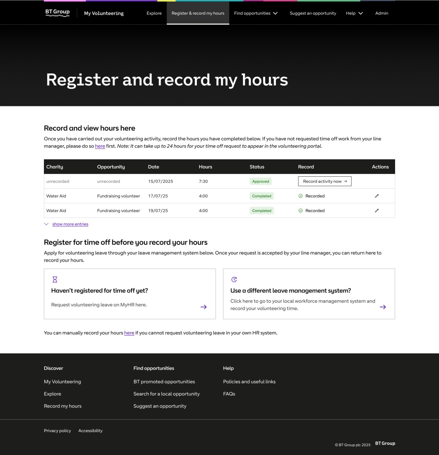
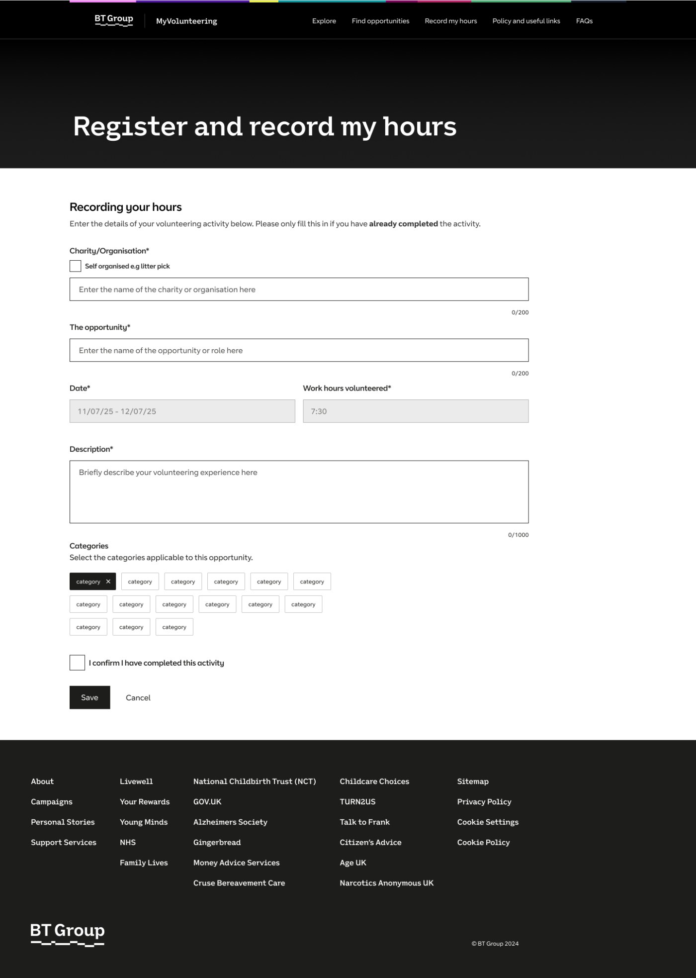
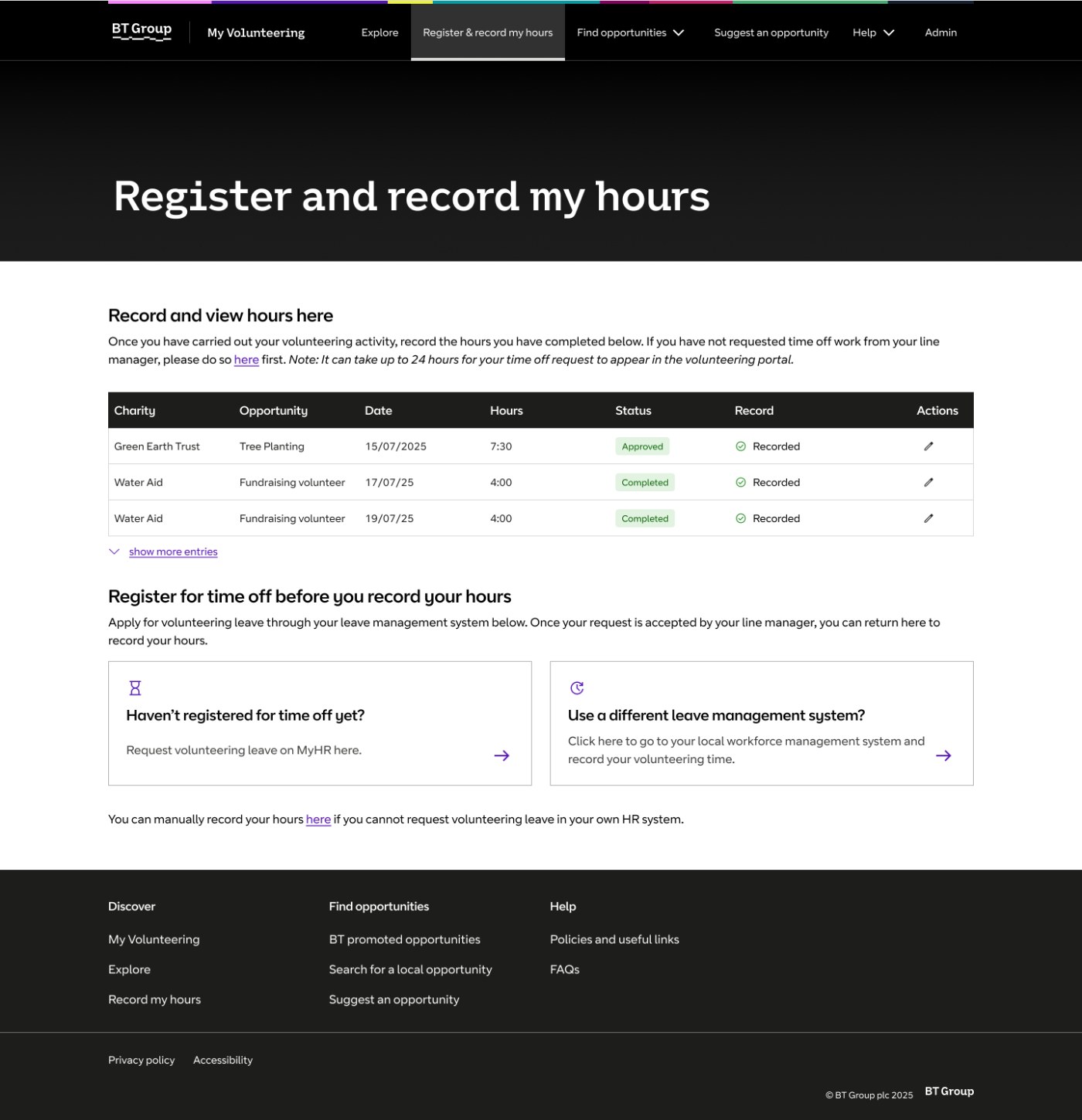
The launched platform brought the whole journey, discovery, application, leave and recording, into one place. In testing, colleagues described it as simple and elegant; stakeholders saw the benefit of the integration through better data almost immediately.
The most important outcome for me was the reframe itself: treating a reporting problem as a service problem. The blueprint that made that argument is now the definitive documentation of how BT's volunteering service works.